For those who know me fairly well, it’s no secret that I’m not the world’s most decisive person. It doesn’t mean I don’t have a clear vision of what I want….it just takes me a while to figure out what will accomplish that vision, sometimes. The current decision for which I’m a little stumped is that I have a FREE 16×20 canvas to order (thank you WPPI & Canvas on Demand!) and it’s hard figuring out what photo to order for said canvas! I’m really, really excited to be gaining some office space next month when Aaron & I move to a 2-bedroom apartment (yay!) so I’m going to use this chance to start getting some photos to put up in my work space. I figured I might as well share a few of the choices I’ve narrowed it down to and see what you guys think! (Note: this isn’t a poll where popular vote will WIN, necessarily, but I still like getting input…. :)
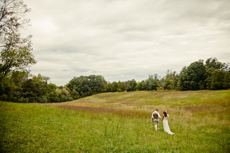
Ben & Amie:
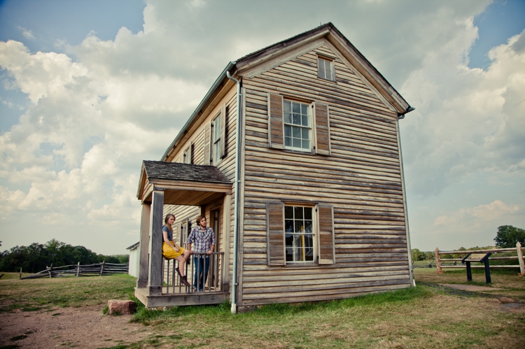
Danny & Janelle:
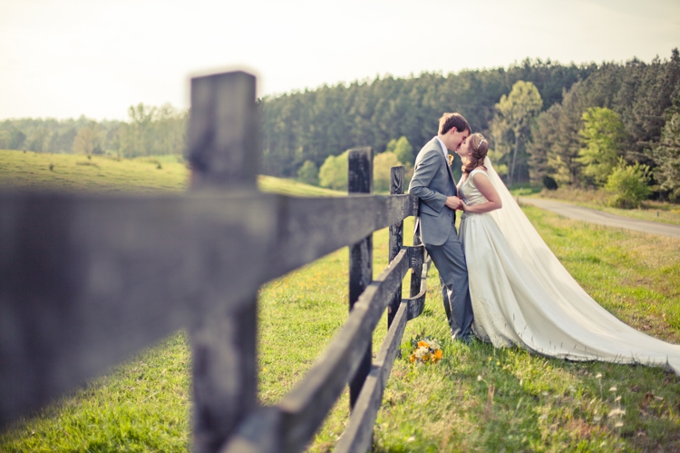
Peter & Kari:
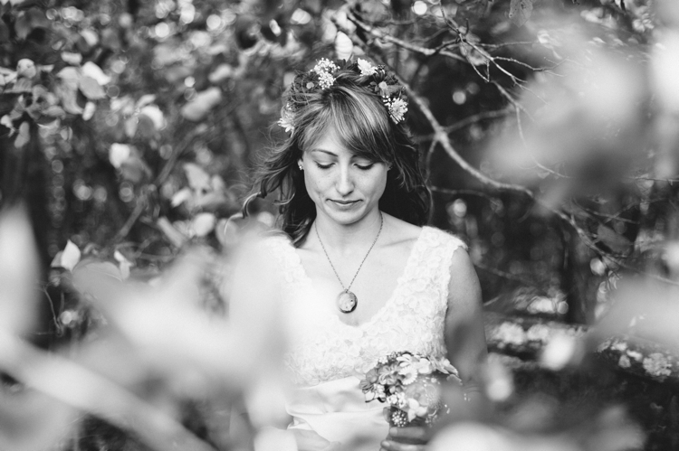
Ashley:
A similar photo, but I like them both so much! My sister, Aimee:

Aimee, again: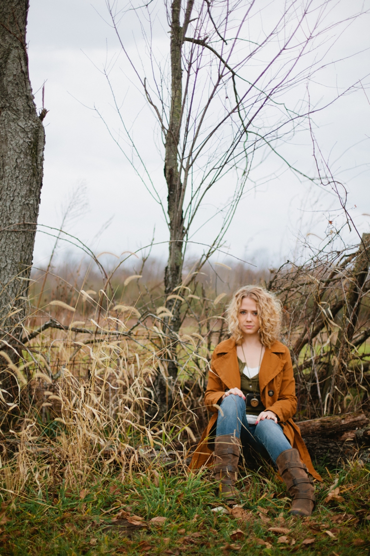
These are just a handful of ones I think could actually work well as a 16×20, which is kind of an odd shape for me, honestly. I don’t like that crop very much, but when it’s free, I’ll certainly take it! It really IS hard to choose out of SO many lovely weddings and shoots that I’ve had the privilege to shoot. The good news is this won’t be my ONLY canvas order, by any means. But a girl’s gotta start SOMEWHERE! So, thoughts/opinions are welcomed! Which one strikes you the most? What do you think would look lovely hanging on the wall of my soon-to-come office space?
Danny and Janelle!! Unless the crop is really bad, thats my favorite. I like the colors, and I think it would bring a lot of YOU (color, texture, personality) into the space right away until you order more. :-)
peter & kari!! or ashley :) they’re all so beautiful, but for your office i feel like those show off your talents best!!
I’m with Lauryn on this one! Danny and Janelle – I love the texture and the pop of your mustard yellow (and even some your brand’s grey and brown tones in the house). Plus, I think it has a great sense of scale and spaciousness that would look great on a wall…
All the shots are beautiful, but I think that Danny and Janelle would be a better fit for the size + would showcase you and your brand. Plus, it’s pretty dynamic, so it’d be a big, “BOOM” in your office. :)
I say Ashley due to the edges of the canvas taking off a inch or so on all four sides. I do adore the last one of your sister just saying… love the colors and feeling of that image.
OBVIOUSLY I’d be super honored to hang in your office :) But I think it’s more of a question of what you want the feel of your office to be, because for me, they all give off such different feels! For me:
-Ben&Amie is more rustic earthy
-Danny&I is more rustic and, like, epic?? Idk, the picture to me is epic haha :)
-Peter&Carie is more sweet and vintage
-Ashley is very whimsical and the B&W makes it like, classic/sophisticated
-Aimee is your sister, so it makes it much more personal!
Anyway, they are seriously all amazing, and I don’t think you could choose wrong!!
I’m with Lauryn and Jennifer on this one. Of course I love the very Southern looking setting and the touch of yellow from Janelle’s skirt. I will admit though, I had a hard time between that picture and the one of Ashley. I LOVE THAT ONE, but you know I’m a big fan of black and white and anything bridal in my office so that is probably why I was so eager to vote for that shot. They are all wonderful, Tori, and I can’t wait to see the canvas once you decide which one to go with! :)
I feel like the one of Ben & Amie would really make your office space look larger and more colorful. Also, every time you see it, you will be reminded of why you are slaving away at your computer, for your couples.
Danny and Janelle and Peter and Kari!! I could stare at those all day long :)
This reminds me of your debate with Aaron and not wanting his face hanging in the bedroom lol. Are you using this room as a guest room and office, or just office? If just office, they are all beautiful and just pick your favorite. If it’s a guest room too, then do you really want a close up, big picture of peoples’ faces staring at your guests? I think the first 2 (especially #1) would work best to show off your work, without having big pictures of people’s faces watching you.
I feel like either one of your sister might almost make it seem like you got to spend quality time with her each day. You and Canvas Aimee could have tea together every morning.
Golly I can see why you have such a hard time choosing!! Any would look wonderful, but my top 2 favorites are Ben & Amie and Danny & Janelle!
I would canvas the one of Peter and Kari against the fence or the b&w of Aimee. Gorgeous work!
Ben & Amie! :) I love that shot…it’s gorgeous! And I think it would make a really beautiful dramatic canvas :)
Peter and Kari :D
Another vote for Danny & Janelle! It’s beautifully dynamic and entirely unique! (Love those clouds!!) The colors are amazing and I feel it’s fairly flexible if you want to change your “feel” every now and then. It’s like an album cover for a best-selling artist! :)
Ben and amie or Peter and Kari. The one of Peter and Kari might be my favorite wedding image of yours!
second one!! Danny and Janelle. that’s one of my favorite engagement shoots you’ve done!
I looove the one of Ben & Amie! My second choice would be the very last image of your sister, Aimee. =) Can’t wait to see what you pick!
danny and janelle. hello, pop of mustard yellow.
I think I like the idea of Danny and Janelle or the second one of Aimee. Either has a sort of “brandy” feel and both would go with your business colors. I could also see either one in an actual office space somewhere, so that’s a plus, as well.
It’s a toss up between Danny and Janelle and the one of Ashley. Tough call, Tori! I look forward to seeing what you end up going with!
[…] you AGAIN to everyone who gave feedback on Tuesday’s post. It’s so hard choosing the first few prints that will grace my office walls, but as I read […]