So, I’m a little late in this second post on sharing more about my rebranding process, but I think it’s such a fascinating and important process to share because sometimes it’s hard to know when or IF you should rebrand, and if so, WHAT you should be changing with the rebrand. If you missed the first post, you can check out The Why behind my choice to change my business name and the visual rebrand that came with that.

Today, I’d like to share more about how I decided what I wanted to change with this whole rebrand, or as I like to call it “brand maturing”. Since I’d had the Marvelous Things brand for 6 years, with a fabulous custom logo and site (that I loved!) for 3 solid years, I’d come to know what my style was, who my ideal client was, and what really made me “tick” stylistically as both a photographer and brand. Over those three years, especially, going from 25 to 28, I grew a lot and noticed a shift in the images I liked to take, the places I liked to shoot, and the “catch phrases” I used to describe my brand and style. For instance, I went from “bright” and “whimsical” to “sentimental” and “handcrafted”. It didn’t mean everything changed, though. I would have said my brand was “eclectic and vintage inspired” as Marvelous Things and continues to be as Tori Watson Photography. So, how did I decide what I wanted this new version of my brand to communicate differently than my old one, without a complete departure of what I’d come to be known by? Here are a few steps I took that really helped!
1) Identify what you still love about your current brand.
In doing this, you can pinpoint the things you’ve really been successful at doing, already, and the ways you’re already communicating the style that you want. If you’re attracting your ideal clients the majority of the time, then be sure to figure out what IS working so that you don’t go and completely change that with a rebrand or “brand refresher”. For me, I’d put a lot of my own personality and style into my brand and I knew that was successful for me. Essentially, my ideal client is someone who is a lot like me – enjoys eclectic and unique style, maybe enjoys thrifting, is really into supporting local culture and businesses, is sentimental and loves to add special meaning to things. I found that shooting weddings where the couple put a lot of effort into making it special to them and their story and their families, and even to their community, were my favorite. So, I definitely knew I wanted to keep an emphasis on sharing a lot about me and my own interests, because I felt that was helpful in drawing the kind of clients I will best click with. I also knew I still loved mustard yellow, and that color had come to be associated with me, so it would have hurt my brand to remove it and go with a whole new color scheme.
2) Identify what you DON’T like anymore, and why.
Once you’ve identified what aspects you do still like, it’s pretty easy to pinpoint the main things you want to change or fix with a rebrand. The most obvious answer for me was clearly the name change. I wanted to go from Marvelous Things Photography to Tori Watson Photography. But with that, I also wanted to move away from the lighter, brighter, more whimsical feel that I had with my previous site (light gray background, bright while doilies) and move to a warmer, cozier, more handmade and timeless feel. I wanted to remove any “cutesy” elements, and go for a simpler approach, while still maintaining a vintage-inspired and eclectic feel.
3) Create visual inspiration.
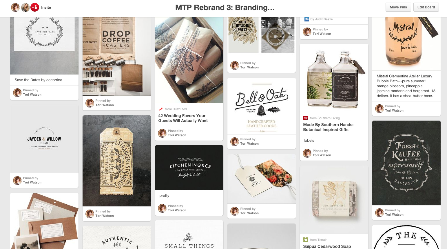
This one is huge for me. Writing out your brand goals and keywords and “the why” are all SUPER important, but you can’t stop there. You’d be surprised how starting Pinterest boards to communicate the “feel” of where you want to go with a rebrand will help it all come together even for you. Not only is it helpful to your designer, but as you’re collecting images and ideas that stand out to you, you may realize some of the things you THOUGHT you wanted aren’t accurate. Likewise, you might pin an image and then realize while it’s pretty….it really does nothing to communicate where you want your branding to go. If you ask yourself “What is it that I like about this image, and how would it enhance my brand?” as you put together pinboards, it can be one of the most helpful steps in the whole rebranding process. Also, in my opinion, one of the most fun! It’s so cool to have one place of all your ideas visually represented, and to be able to check back on that as a reference point once your rebranding process starts. These are two snippets of some of my rebrand inspiration boards:


What I was drawn to were keeping mustard colored elements, a strong presence of black & white images, a logo that felt somewhat hand-stamped and mixed both masculine/strong fonts with more feminine/floral elements. I wanted other brown/neutral tones throughout the site, and layered elements. All of which I think we achieved beautifully. The best part is being able to look at your new site & brand and see the influence of your inspiration board, while still having a unique creation of your own.
4) Hire a designer to put it all together.
I know it’s an investment, but I’m telling you, the benefit of having someone who is not only professionally trained and gifted at design, but is also outside of your brain is sooo beneficial. Sometimes what makes sense to you, or that you think communicates something specific, isn’t how it comes across to others. So having someone to bounce ideas off of, but who can also create more visually stunning representations of your stylistic ideas is invaluable. Of course I only recommend this sort of rebrand IF you’re at the point in your business where you know yourself, your style, your brand and your ideal client well enough to make it worth really investing in. If you’re in the earlier stages of discovering all of that, then it’s probably not time for a huge investment of a rebrand, yet. But that’s a different topic entirely. In my case my amazing designer and friend Jen Olmstead of Tonic Site Shop knew how to take the concepts of my old brand (that she had also created) that I wanted to keep, while mixing them with a new fresh look to come together and perfectly communicate what I was going for. I would have never been able to accomplish that without her!
If you’re in the middle of trying to decide if it’s time to rebrand, or refresh your current brand, I hope these few tips are helpful!
These are such good tips, Tori!! I love it!!
Thanks, Lauren!! Glad you enjoyed them! :)