One of my favorite things to do is decorate our home in a way that expresses our personalities, is unique and creative and works within a budget. In preparation of welcoming baby #3 in just about 6 weeks, we knew it was time to plan towards moving Margot into a shared room with Llewyn so that all of us had an adjustment period before we’re also all adjusting to a newborn. The kids’ bedrooms in our house are pretty tiny, and Llewyn’s room wasn’t very styled or themed originally. However, I knew that I didn’t want it to seem like Margot was just moving into Llewyn’s space, but rather wanted to revamp the space to reflect both of them so that it truly felt like a new, shared space they can enjoy together. So, after a lot of Pinteresting I came up with some great boy and girl shared room inspiration and couldn’t wait to implement it!
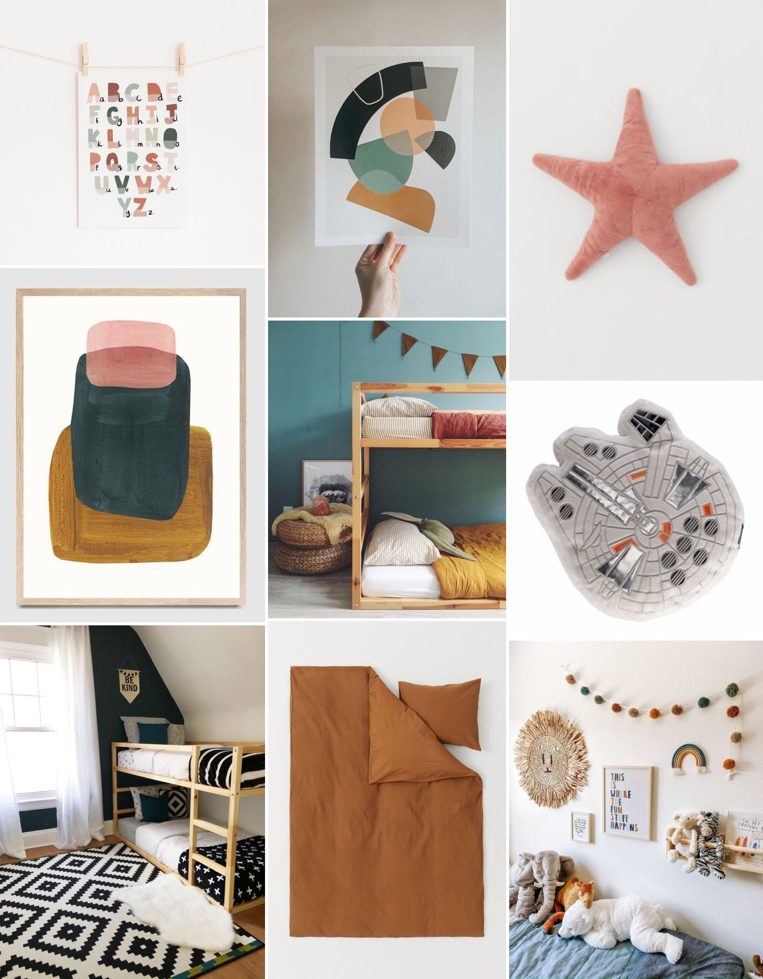
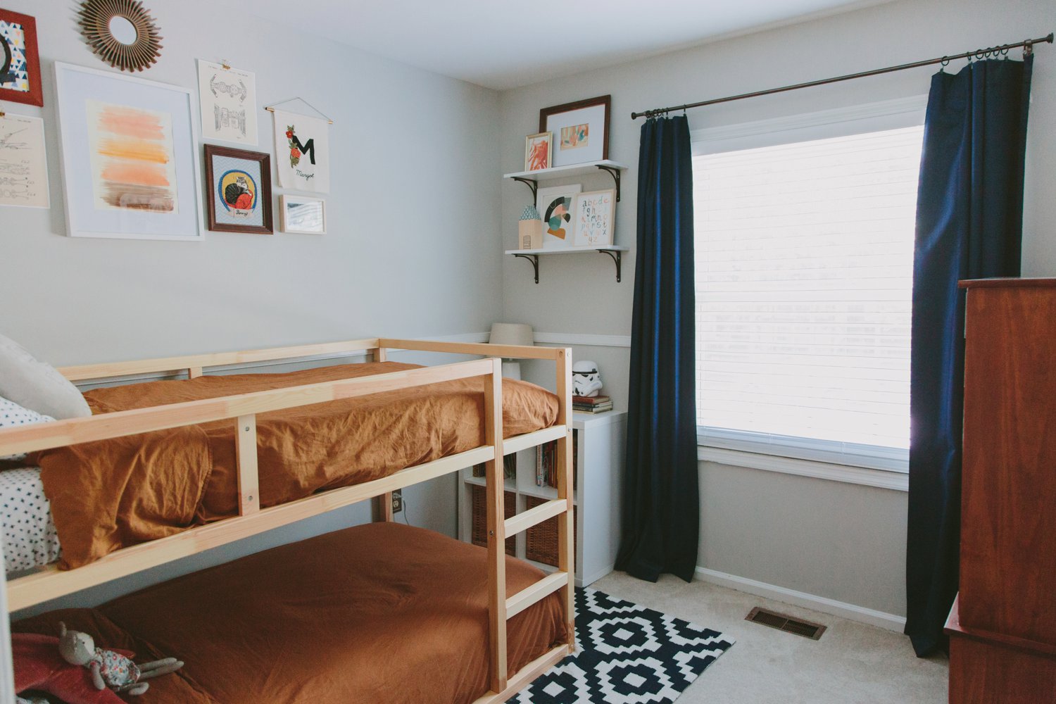
Working with several elements we already had (rug, curtains, dresser, cubby storage unit) so as to keep it as on-the-cheap as possible, I created an inspiration board of how to work in some more color tones that could feel a little more feminine, while still being gender neutral overall. We also knew we needed to pick out bunk beds and I loved all the inspiration I found on Pinterest for the IKEA Kura bed, plus the price point was super budget friendly which made it perfect all around! Here are some of the images on my starting inspiration board.
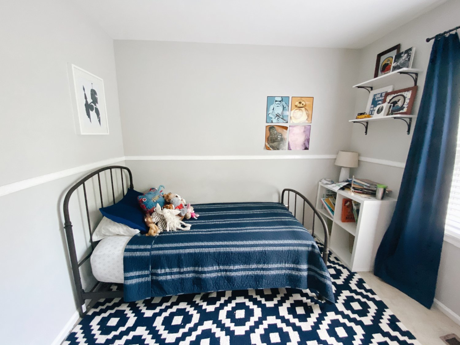
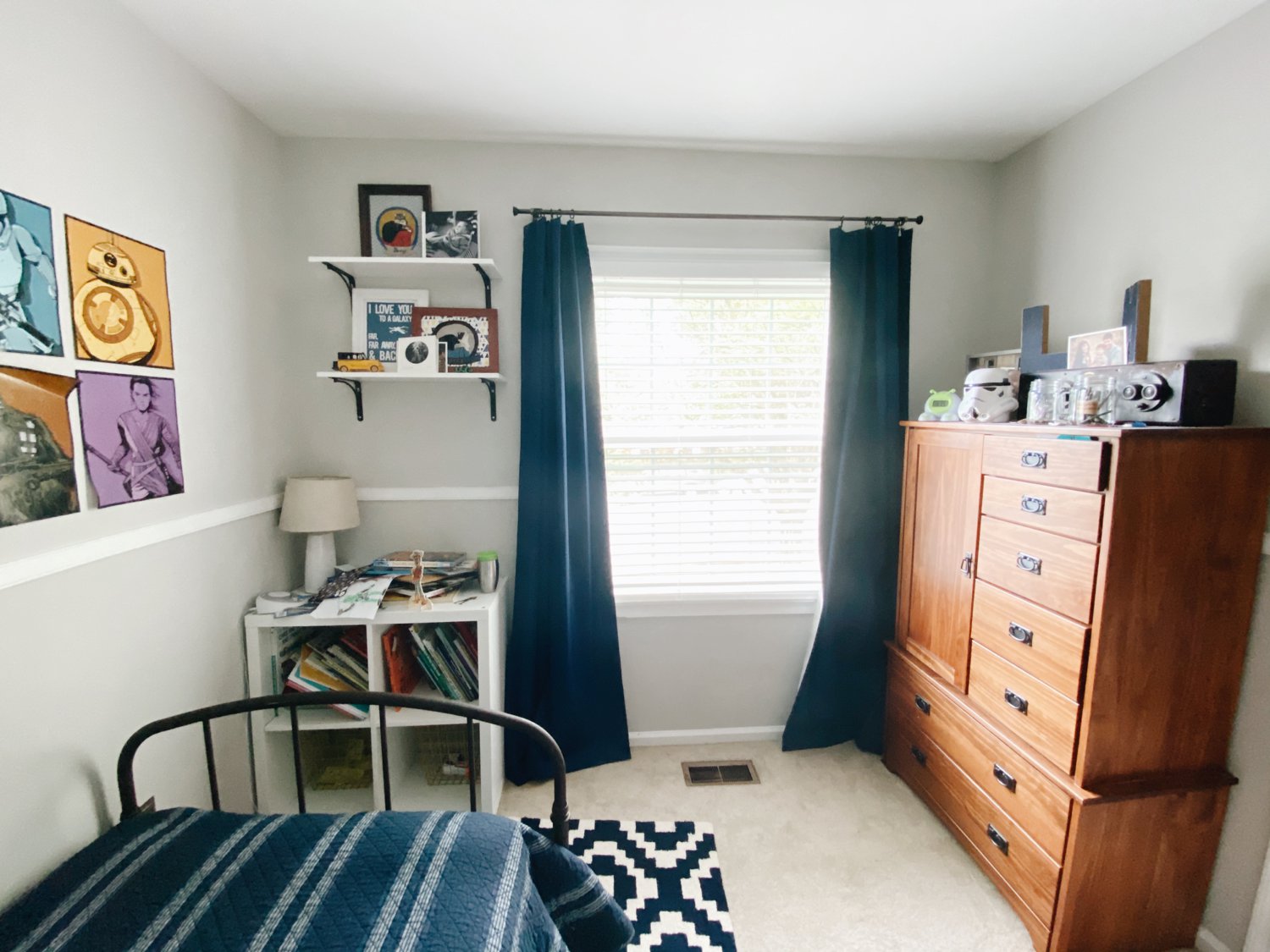
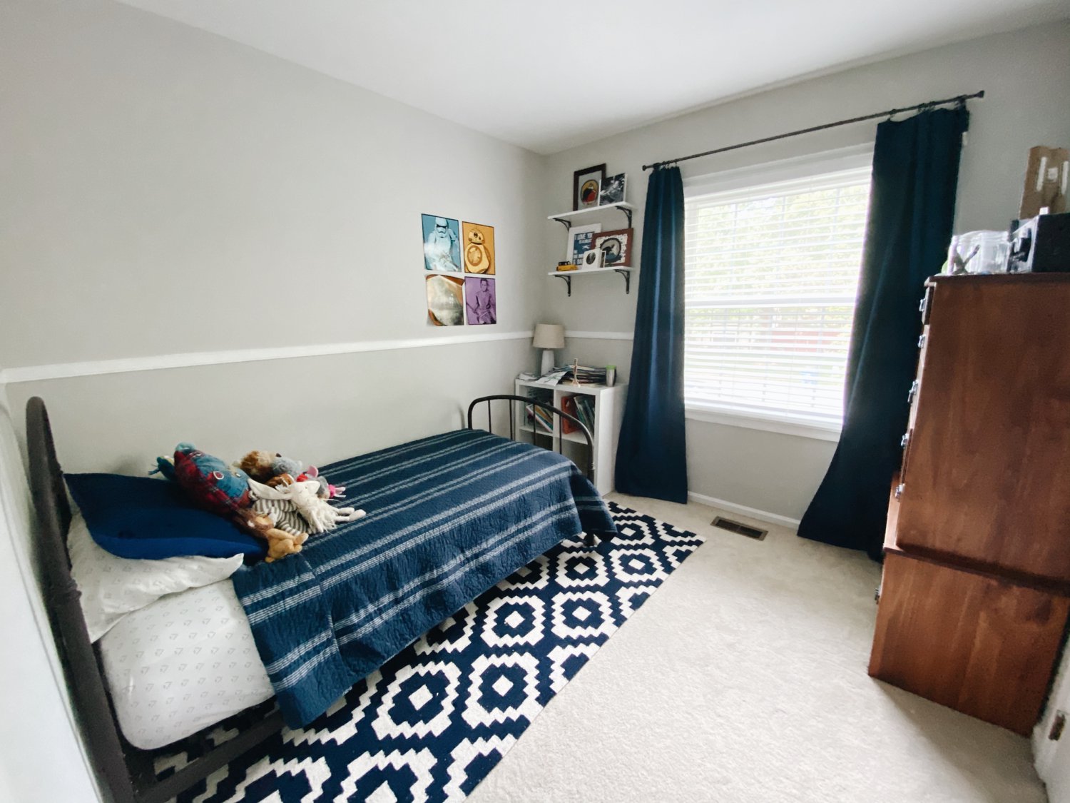
And these are the before images of Llewyn’s room. Like I said, it was pretty basic, mostly utilizing things that had been in his nursery at our previous house, mixed with other pictures he chose to hang on the wall.
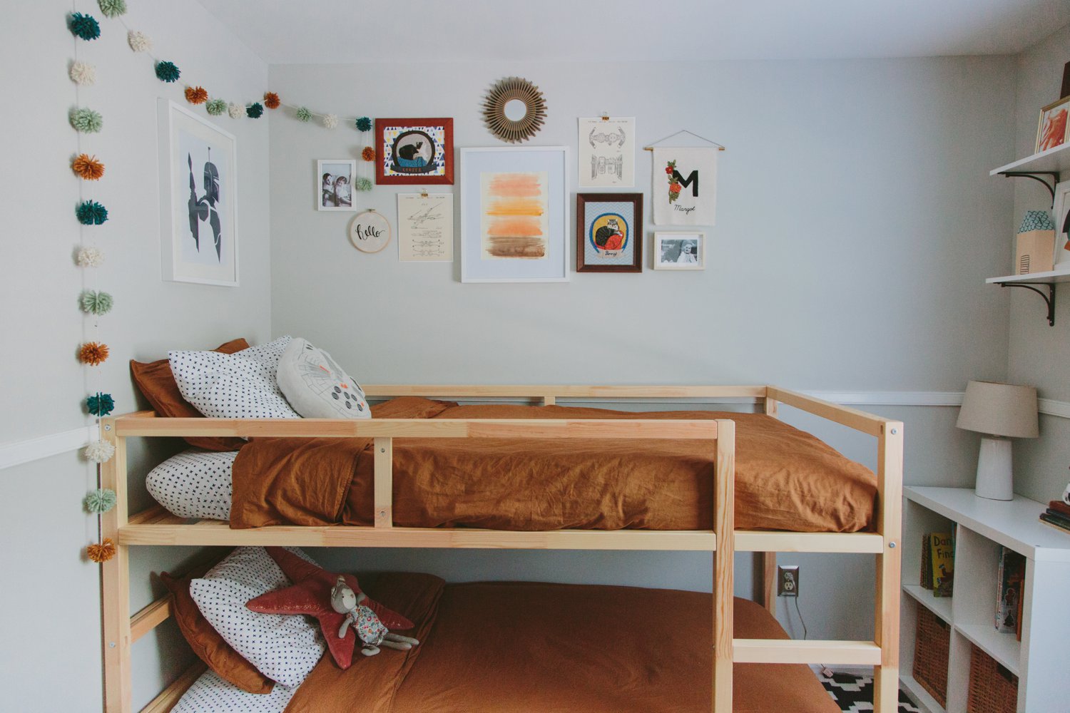
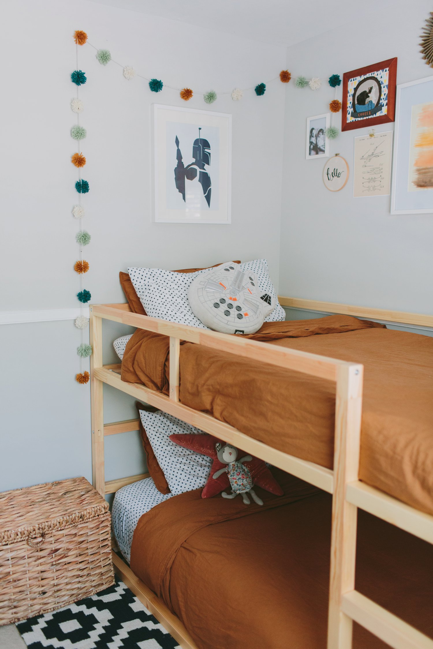
The main things I knew I needed to do to pull the new room together were to mix in enough tones to make the dresser color flow with the light, natural wood of the bunk beds. So, I chose a brown duvet cover to tie that in, plus I wanted to choose a versatile color that could go with other redesigns in the future as they get older. Aside from that, I made sure to use a mixture of wood colors and tones in the gallery wall and other art pieces that I put up and that made it all look and feel so much more cohesive than it would have, otherwise.
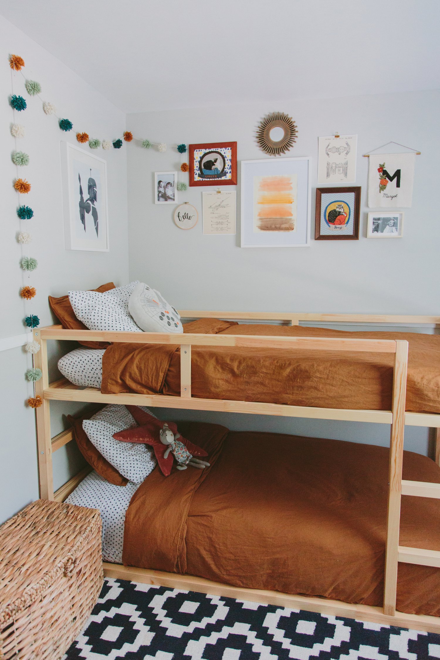
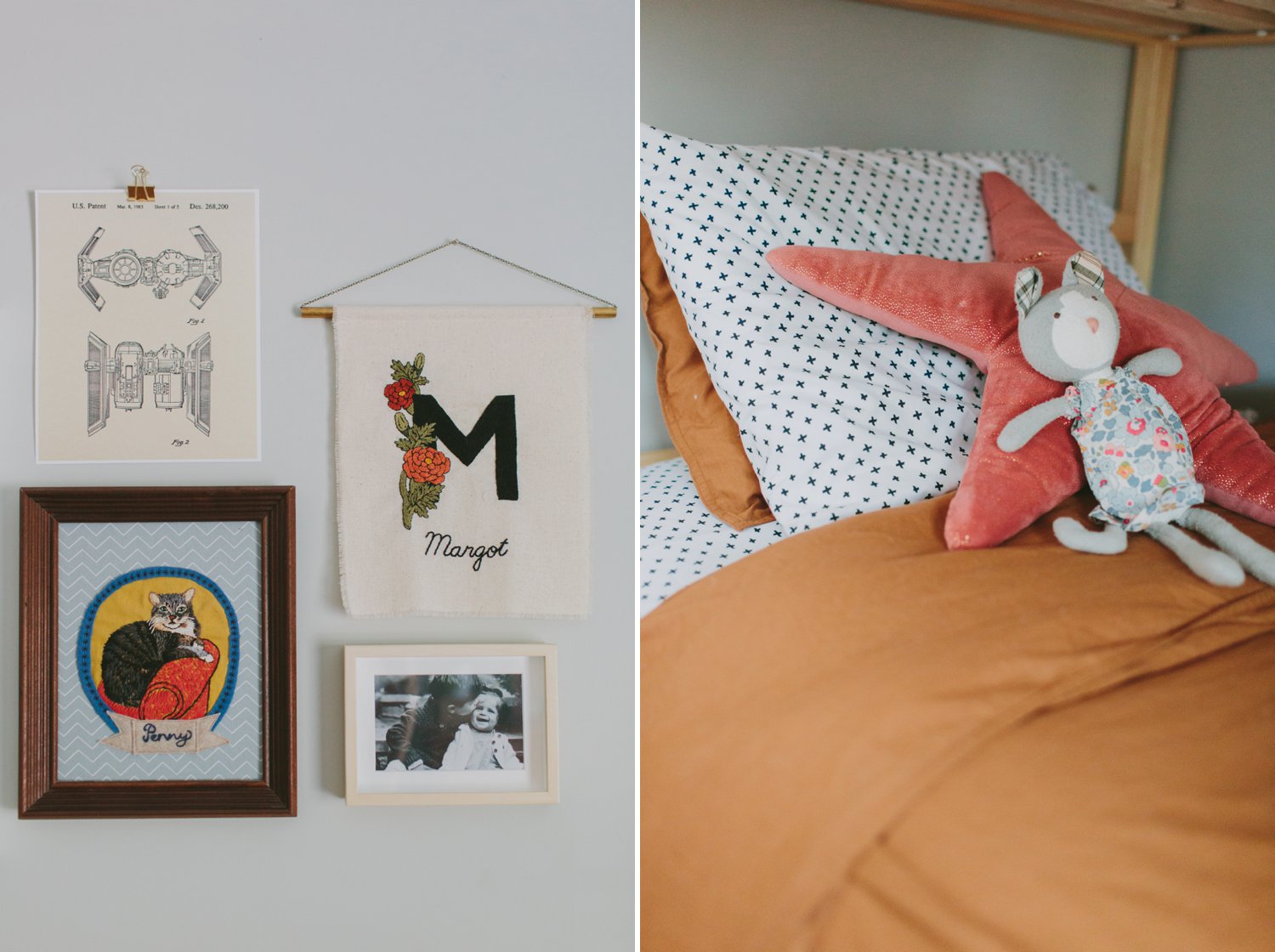
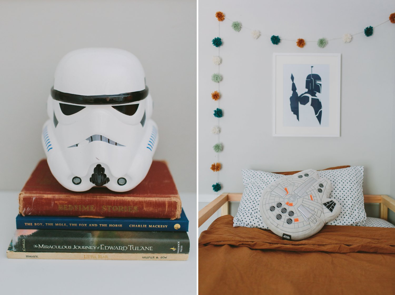
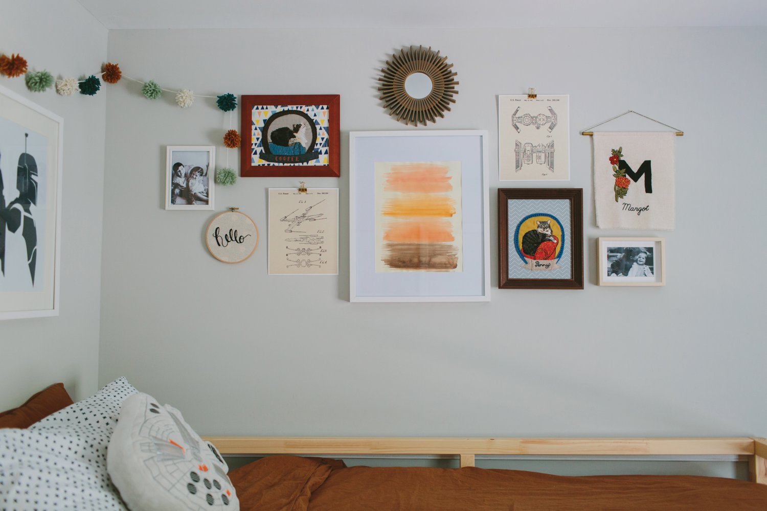
For the gallery wall, we almost exclusively worked with pieces we already had. The Boba Fett print had already been hanging in that spot in Llewyn’s room, so we left it there. The Cooper & Penny embroidered pieces were made by a dear friend in Richmond and had been part of Llewyn’s room since his nursery. The “Margot” and “hello” embroidery prints were by Cristin Morgan and were special pieces in Margot’s nursery room design that I definitely wanted to include to represent her. I added in two Star Wars ship patent prints that were downloads from Etsy, two framed photos of them together, a thrifted starburst mirror, and then I made the center art piece with watercolors to tie in more of the colors of the room and used a frame I already had.
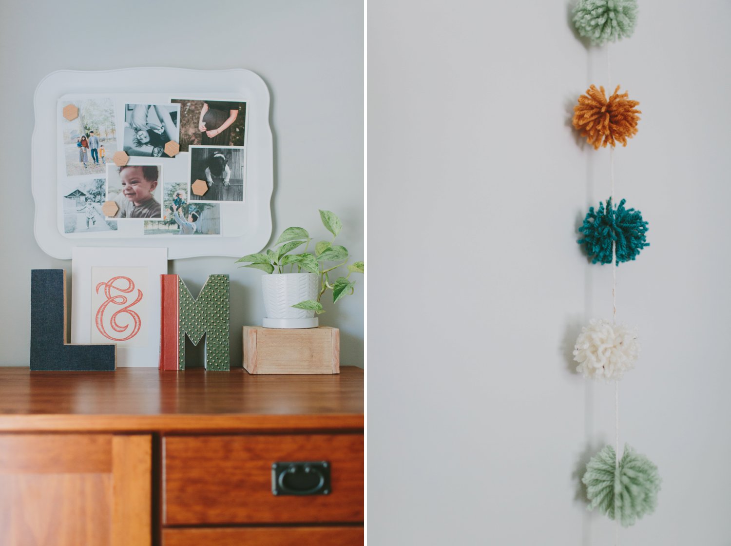
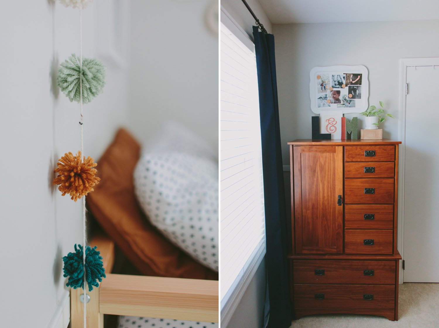
I really wanted some pom-pom garland for a fun, whimsical element so when one of the craft stores nearby was going out of business I bought these perfect colors of yarn for a steal and made it as another way to tie together the general color theme.
The L & M on the dresser were each from their respective nurseries and I loved putting them together along with the DIY’d magnetic photo board that I had previously done for Margot’s room.
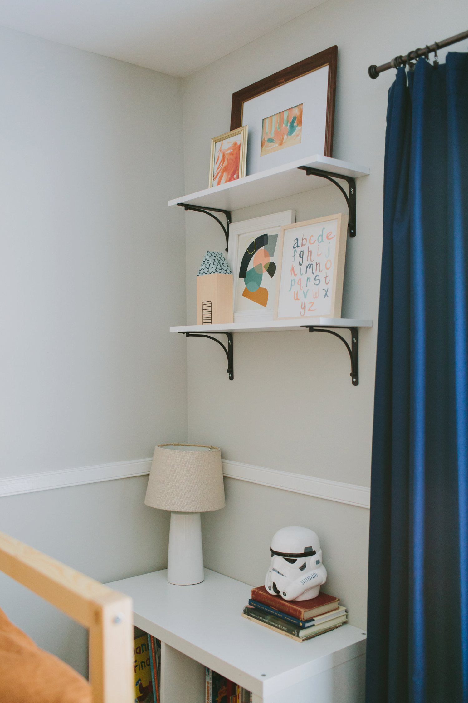
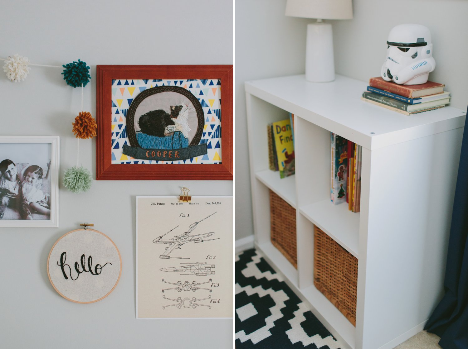
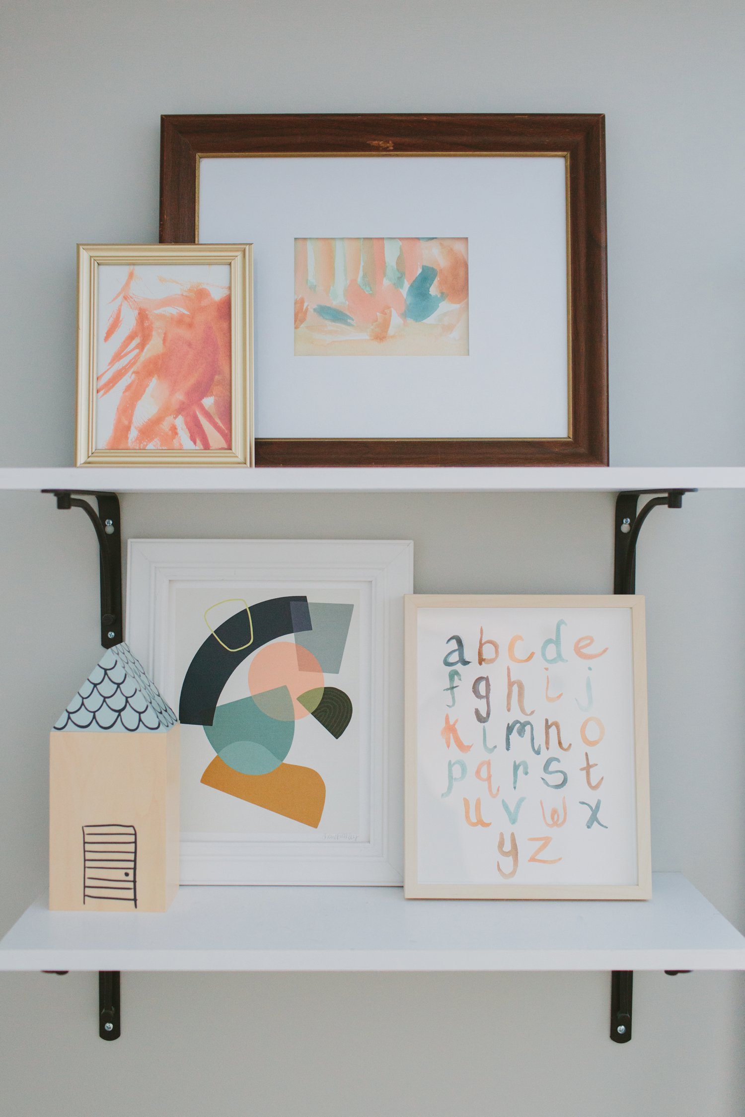
These two shelves are so fun to me. The little house is Margot’s coin bank that she’d gotten for Christmas (and the Storm Trooper head is Llewyn’s coin bank) and I loved finding a way to tie it in. The Figure Form print right next to it was a major part of the inspiration for the room as a whole, so I created the “ABC” painting to go along with it, and the abstract paintings on the top shelf were done by Margot & Llewyn. I love mixing DIY art with purchased art and I just love this little vignette.
You can see that it’s a tiny room, but I really, really love how it came out. The colors make me happy, the cost spent was very minimal, and it feels like such a great reflection of both of them. Additional sources not already mentioned are linked below!
Duvet cover: H&M | Sheets: Target | Rug: RugsUSA.com | Curtains: Target | Star Throw Pillow: H&M | Millenium Falcon pillow: Ebay | Storm Trooper coin bank: Amazon | White cubby & wicker baskets: IKEA